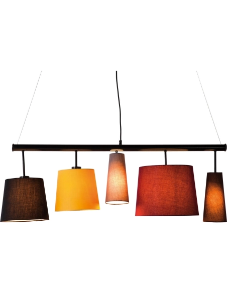
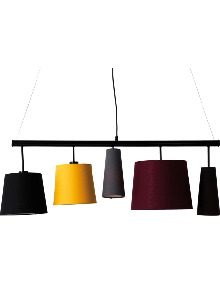
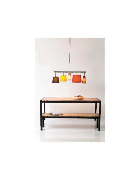
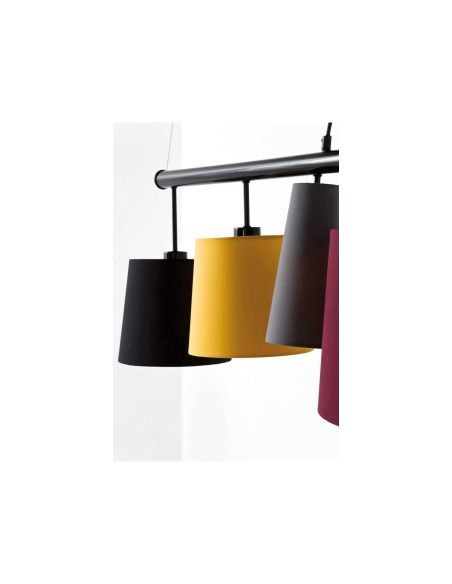
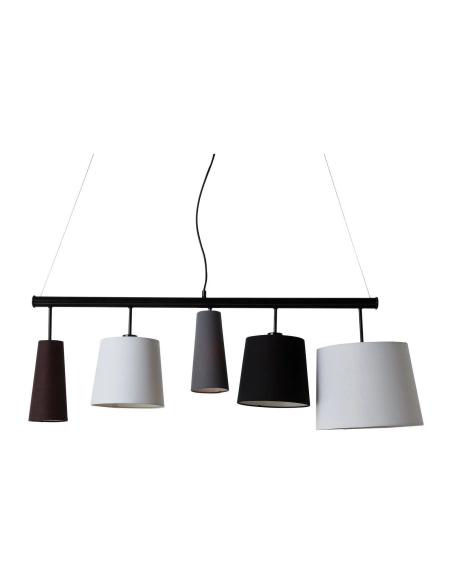
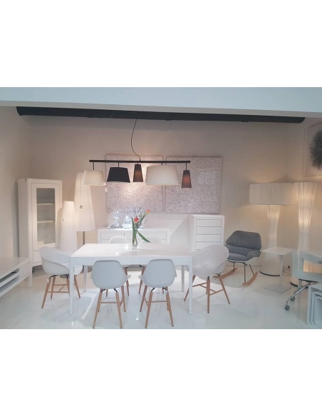
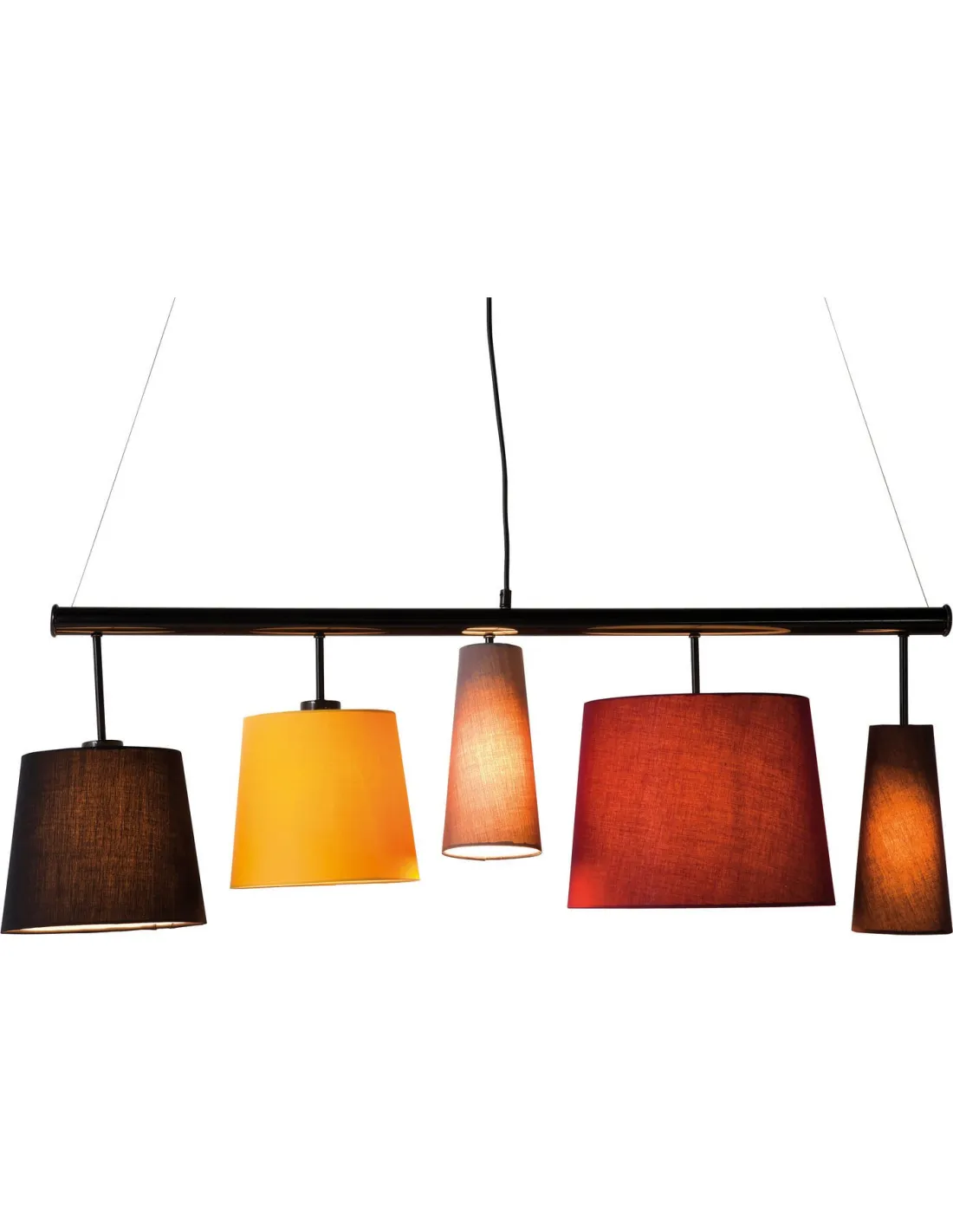
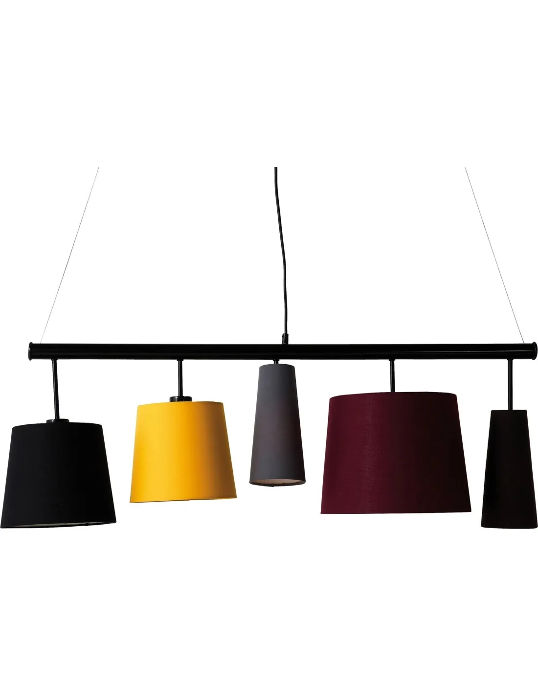
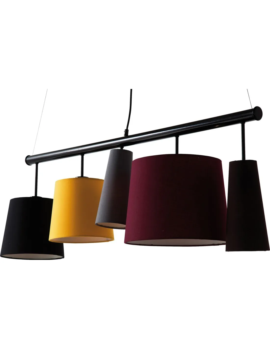
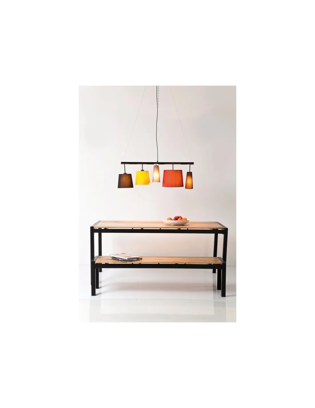
Choosing KARE Design Parecchi five-colour-shade pendant brings into a room an object whose outline and purpose are easy to read. Warm colours enliven the dining table. Keep guests’ sightlines open. KARE creates a graphic light feature. Shades direct light towards the table. At Loft Attitude we first consider the product’s proportions, then its relationship with furniture already in place; that approach avoids choosing by colour or trend alone. Details visible in the photographs help you anticipate its real position, how light meets its surface and how much space it occupies in a composition. It can become a focal point or quietly support an existing scheme, depending on the space around it. Before placing it, compare the measurements below with the relevant wall, surface or circulation area. This keeps the decorative choice grounded in practical use and helps the room feel considered without losing its own character.
A design that immediately catches the eye
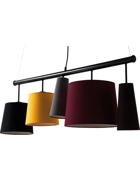
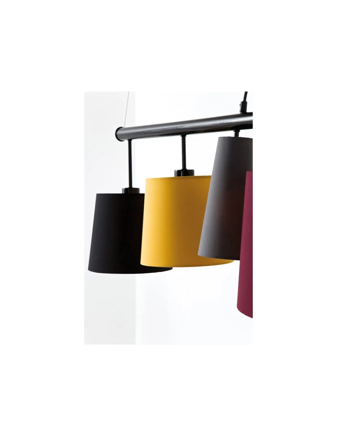
Read the product’s lines first: their direction, thickness and rhythm determine its visual presence. Varied shades create visual rhythm. Above the table, it gives meals rhythm. Detail photographs deserve as much attention as the overall view because they show how finish and shape work together. A pale surface can brighten a darker arrangement, while relief can cast shadows that emphasise the form. We also suggest studying visible sides and junctions: these often explain why a piece feels light, graphic or warm once it is in place. A quiet background allows its details to register without visual competition. Echoing just one nearby material, such as wood, metal, fabric or glass already present in your room, is often enough to make the arrangement coherent. The product can retain its own character without crowding the space. Keep guests’ sightlines open. KARE creates a graphic light feature.
Why choose this piece for your interior?
- Warm colours enliven the dining table. The photograph shows how this line works in a room and helps plan its position without visual clutter.
- Varied shades create visual rhythm. This visible detail offers a practical reference for pairing it with surfaces and colours already present at home.
- Above the table, it gives meals rhythm. This detail helps create a readable space around the piece alongside furniture you already own.
- Shades direct light towards the table. This connection between shape and use makes a coherent arrangement possible with only a few other accessories nearby.
- Keep guests’ sightlines open. Pair that character with a quieter backdrop to draw attention to the piece and keep the arrangement balanced.
Which room suits this product?
The best room depends on circulation as much as style. Shades direct light towards the table. Keep guests’ sightlines open. First identify the viewpoint from which you will see the product most often: entering the room, sitting at the table or standing back from a wall. That everyday view tells you more than a photograph against white. Leave enough free space around the item to read its shape and use it comfortably; something squeezed between two pieces of furniture loses part of its decorative effect. In a contemporary room, a restrained palette can bring out its lines. In a warmer setting, repeating a material already in use makes a natural transition. Finally, check the measurements in the product details and any placement or storage constraints stated here. The arrangement will then be as practical as it is pleasing to look at. Warm colours enliven the dining table. Varied shades create visual rhythm.
A considered choice for a distinctive interior
A distinctive room comes from precise choices rather than an accumulation of effects. Warm colours enliven the dining table. KARE creates a graphic light feature. The product’s form, finish and purpose should remain legible even when other elements in the room change. We therefore suggest connecting it with one existing piece of furniture or material, then allowing its visible details to do the work. This approach lets cushions, rugs or accessories evolve without rebuilding the whole scheme. For a well-kept presentation, follow the maker’s care advice when available and match cleaning to the material listed in the details. Do not infer unusual resistance from a photograph alone: the specification reports confirmed information without promising undocumented uses. This choice earns its place through both its visible character and the practical benefit it really brings to daily life. Above the table, it gives meals rhythm. Shades direct light towards the table.
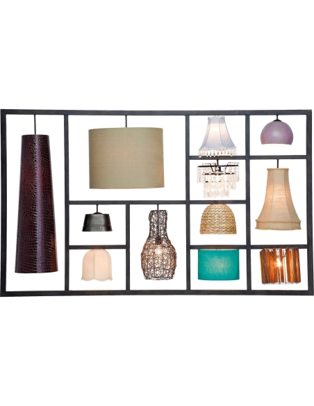
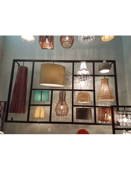
To match light to each use, compare the models in our Pendant lights and chandeliers collection.
Technical specifications
Materials:
Dimensions:
- Height: 37 cm
- Length: 107 cm
- Width: 30 cm
Weight:
Reference: